Me>u
Here I showcase my work and recent projects. This includes case studies, research, user interface designs, and artifact pieces.
Focusing on user-centered design - I'll walk you through my design process. From building empathy for my users, defining what needs to be done, brainstorming ideas, prototyping, and testing.

Problem
America has the highest obesity of adults living in the world today. Obesity is a very serious concern because of the health risks, poorer mental health outcomes, reduced quality of life, and the leading causes of death in the USA.
Over 68% of Americans are considered overweight, over 32% are considered obese, and over 6% are considered extremely obese. It is estimated that 3/4 of Americans will be overweight or obese by the year 2020 (reference).
Our task was to design a mobile website that would help the obesity epidemic in the United States.

“Give me six hours to chop down a tree and I will spend the first four sharpening the axe.”
Design Process
First, build empathy with our users by conducting research, defining the problem, personal interviews, observations, and surveys.
Second, define and analyze research by creating an empathy map, jobs to be done, persona, and creative brief.
Third, ideate and brainstorm user story map, sitemap, information architecture, hierarchy, low fidelity sketching, wireframes, and establish minimum viable product.
Fourth, prototype ideas, user on-boarding, feedback, test low fidelity mock-ups with users, communicating design, and style guide.
Fifth, conduct testing with users, user flow ability, receive additional feedback, and test some more.

Research
The first step was to create assumptions of our users. With our assumptions, we created interview questions that we iterated, revised, and changed in order to identify how we could empathize with our users and have stronger depth about their lifestyles.
Our interview questions could not be leading, biased, or close minded. Over 3 days, we conducted 15 personal interviews and received 22 survey results. We took our data and broke it down.
DISCOVER
47% of our interviewers skipped breakfast, 29% didn't go out of their way to try and eat a healthy snack during the day, 62% drank soda during the week, 48% frequently eat out, and 46% tried to exercise more than three times per week.

define
It was difficult for us to pin point the problem we were going to solve. How could we help our users change their unhealthy habits or promote a new healthy lifestyle?
From analyzing our data, some of our users struggled with maintaining a healthy lifestyle because of bad habits or lack of motivation. We decided that these were the problems we were going to solve.
“When creating content, be empathetic above all else. Try to live the lives of your audience.”
user
Here is a version of our first empathy map that was more focused on helping our users with spending less money, eating healthier, and feeling better.
We also built a persona to help us better empathize and understand our user as well as the problems we would try and solve.
Empathy
Some of our interviewers stated that they would be more motivated if they had some type of social group. Others said they were super competitive and they would be more motivated if there was some type of reward system like real money, point system, or leaderboards between friends.
“Design is not just what it looks like and feels like. Design is how it works.”
Brainstorm
For me personally, defining our user story map was the most helpful and powerful piece of this entire project. We weren't exactly clear with the direction of our project and we all had our own ideas of what we were going to build.
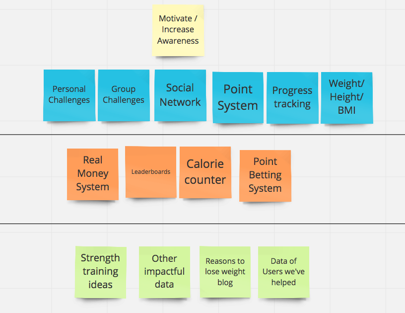
We took sticky notes and wrote one word per sticky. The word could describe a feature, challenge, task, or something applicable to our project. We took all of these sticky notes and combined them on a wall. For preservation purposes, we took a picture and then recreated our user story map on realtimeboard.com.
MVP
Together as a group we defined our minimum viable product. With so many ideas, this helped us define our project and where we wanted to start.
We drew a line below our minimum viable product of what our project would include as well as our first release; personal and group challenges, point system, personal information, progress tracking, and a way to sync your social network.

“People forget that sometimes doing it the long way teaches you more about how to think and do. ”
Sketches
The three of us each created our own 10x10 sketches for our user login, onbaording, and iterations of our MVP. We took our ideas, put them together, and created another 10 for our user flow.
Wireframes
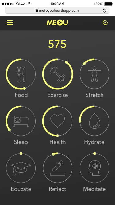
Our first iteration would include login, onboarding, data collection, user profile, dashboard, and challenges. Our dashboard would include pieces like progress tracking and our point system (sticking to our MVP). Our onboarding would also include the social network and device sync. We used Sketch to build our wireframes.

Feedback
Before diving into our style guide and high fidelity screens, we wanted to make sure the flow made sense to our users. With our sketches and low-fi wireframes we received some feedback from several people.
"If this is supposed to be a website, how do I know what it's about before login?"
"Will there be any type of visual graph to show my progress?"
"How will the gamification and point system work?"
STYLE GUIDE
We decided on yellow as our main color because it represents energy, positivity, increased mental activity, and muscle energy (reference). We also wanted to use black and grey for consistency and simplicity. The font we decided on was Avenir.

landing page
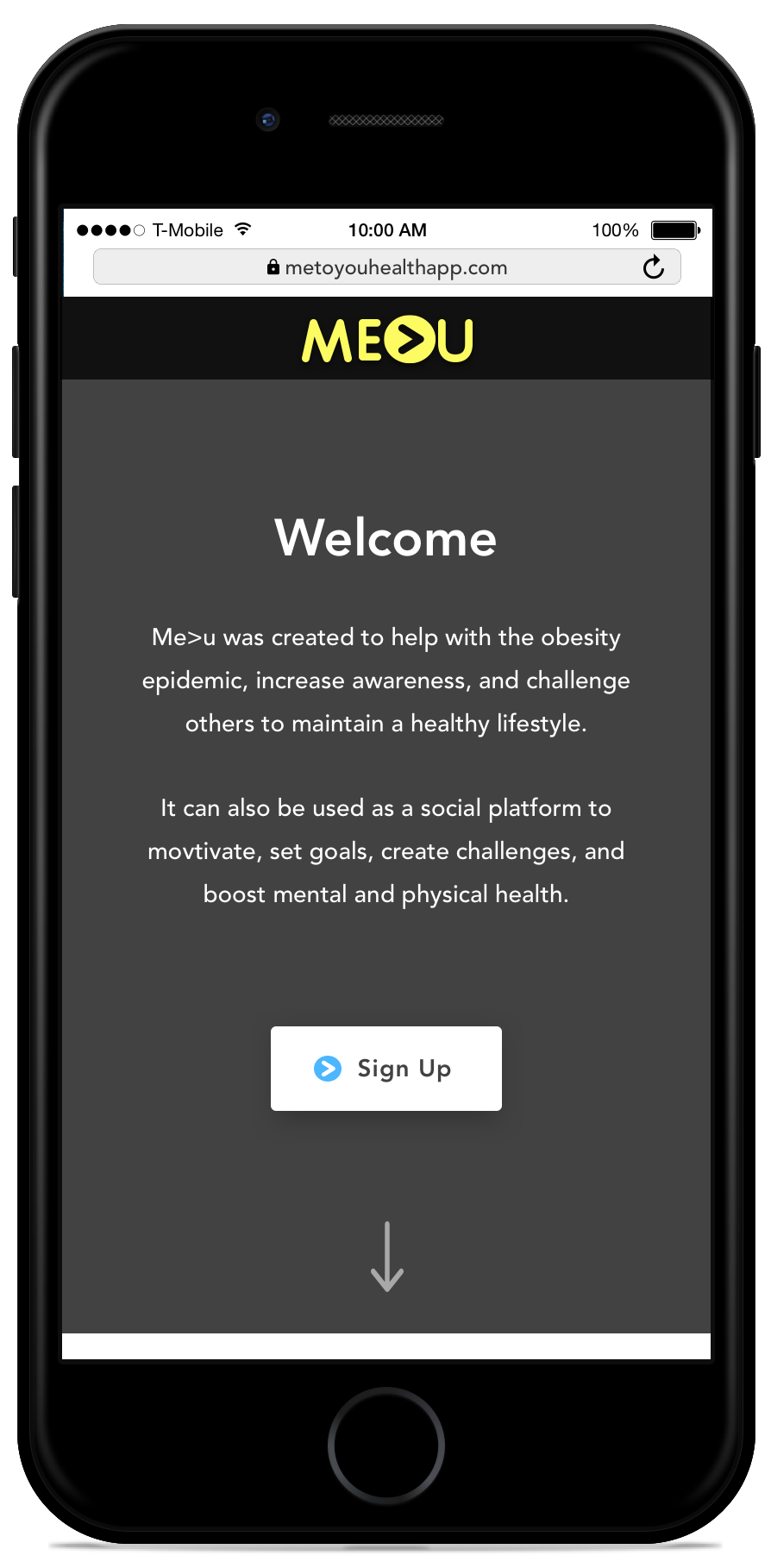
Based on user feedback, we created a landing page to help describe what our site was about and how it can help. The login screen could potentially be included on this page.
login
Our picture chosen of this girl running was to emphasize exercise. Even if you didn't know what our app was about, you would understand that it's health or exercise related.
We increased the contrast to make the sun brighter in the background. The picture on the left shows our main loading screen when first loading.
Device & Social Network Sync
If the user chooses, they can sync their device and all that info will be brought over. The user can also connect their social network. This will make the app fun and interactive and an easy way to challenge friends or family.
ONboarding
We created challenge templates based off what our user selected and the category our user would like to improve in. When the user selects their interests, the selected picture turns to the right with high contrast and color.
User Profile & Dashboard
If the user skipped they will need to input info. If they have already sync'd a device that has their information, it will already be displayed like the example on the right. This is also showing an example of how challenges would be displayed with progress tracking.
Challenges
The plus icon on the dashboard or via hamburger menu, the user can create a new challenge. These can be solo, 1v1, personal network, or public group challenges.
Progress
The user can track progress with a visual graph of how well they are performing for the week, month, or however long their current challenges are.

Prototype
Our high fidelity prototype was built with Marvel. We may add some annimation or effects to the pogress page in the future.
